Shopping in a store can be a fun experience.
So often customers are immersed in beautiful lighting, surrounded by colorful displays, and assisted by knowledgeable employees—all physical characteristics that are difficult to replicate online. And for marketers in mobile commerce, it’s especially hard to imitate the sense of discovery and inspiration that comes while perusing the aisles of a store.
“Physical elements and imagery are particularly important for us because our customers are highly, highly visual,” says Katherine LaFranchise, assistant vice president of digital at Urban Decay, a L’Oréal cosmetics company that focuses on cutting-edge, vivid color palettes. “They gravitate heavily toward experiences that are visual, like on Instagram and Pinterest. Having those visual components gives them the ability to engage and enriches the [digital] shopping experience.”
Urban Decay’s colorful products are sold primarily online and in retail stores such as Macy’s, Sephora, and Ulta. So, creating a stimulating digital shopping experience—particularly the mobile experience—is vital to the beauty brand’s success.
Marketers at Urban Decay, however, say there are inherent challenges that come with mobile commerce, such as limited screen size and zero interaction with other shoppers and employees who might suggest appealing products. “One of the major challenges was enabling customers to find the makeup products that they were looking for or perhaps don’t even yet know that they want,” LaFranchise says. “Just like in a store, we wanted a more engaging and fun way to discover.”
In essence, Urban Decay wanted to give shoppers something much more human and visual.
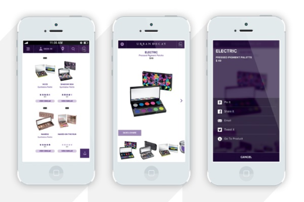
LaFranchise says the marketing team also wanted more social shares and product views per session—both of which are fueled by strong visuals. So, Urban Decay set out to retool its mobile shopping experience by presenting products that are more relevant and visually appealing.
But there was one major question: How could marketers determine which products are the most appealing and relevant?
“The secret was in Urban Decay’s customer reviews,” says Lisa Roberts, VP of marketing at Edgecase, a platform that uses machine learning and human content curation to determine the best products for each customer. “We mined the data in Urban Decay’s reviews, looked closely at highly rated products, and determined real words that people used to describe those products. So, ultimately, we used humans to figure out other humans.”
Roberts says that customer-generated information added a new breadth of data to Urban Decay’s mobile commerce strategy. She says that data coupled with colorful, large images is a winning formula for the makeup brand. “[Marketers at Urban Decay] empowered people to shop with their eyes, and the end result is a shopping experience that’s more like in-store,” Roberts says.
The results, LaFranchise says, have been stellar. Shoppers on Urban Decay’s mobile site view 5X more products each session—or about nine products each session—and nearly 10% share products through social or email, plus marketers are seeing 150% higher click-to-buy conversion rate.
“It’s evident; visual is becoming the new norm on mobile,” LaFranchise says. “[Customers] expect to swipe and tap their way through products that make sense. Now, with data and gorgeous images, we’re giving them that intelligent layer that they’re looking for.”


