Redhook
Situation
Redhook, a 20-year-old craft beer brand, wanted to strengthen its recognition as a reliable and consistent drink from batch to batch. The company wanted to differentiate itself against brands newer to the market. Its marketing plan in 2008 had a media budget under $500,000 and had to engage beer drinkers around
the country.
Approach
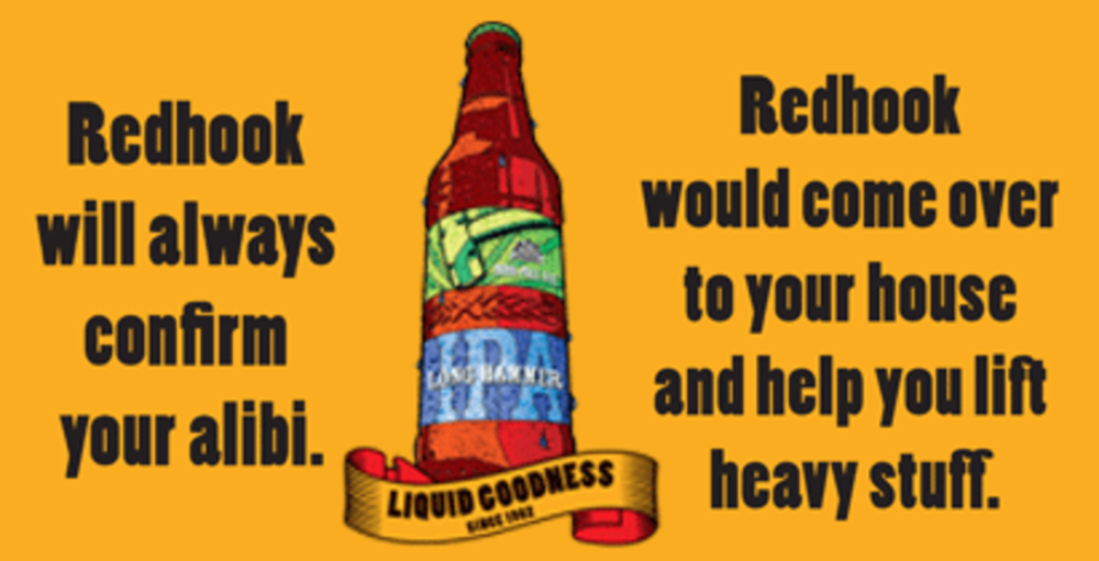
The brewer worked with TM Advertising on a series of print, radio, online and point-of-sale promotions that positioned the brew as “More than beer. It’s Liquid Goodness.” Redhook, personified as the loyal friend, was featured in unique taglines from state to state, offering support for sports teams, relationship pains and work. A coaster-designing contest on WhatWouldRedhookDo.com invited beer drinkers to share their own best bud ideals for a chance to have their coasters distributed across the country.
Results
The Redhook 2008 coaster contest got four times the entrants as 2007. Redhook brand sales grew 20% over 2007, while its Long Hammer IPA saw a 25% lift, becoming the country’s category leader.
-Cara Wood
Western Union
Approach
Western Union has traditionally reached out using e-mail to the Chinese community around Chinese New Year due to the tradition of sharing money with friends and family around the celebration. This year, it worked with Sharpe Partners to personalize subject lines and optimize the creative.
Results
New strategies such as multiple calls to action for different behavioral groups helped lead to a 53% increase in open rates and 60% increase in click-through rates over the previous year.
–Nathan Golia
Wesley Enhanced Living Foundation
Approach
The Wesley Enhanced Living Foundation, working with Fairmount Ventures and agency LevLane, turned to direct mail to help raise more than $23 million for the renovation of a retirement community. Twelve mail pieces, to be sent over 20 months, each include a cover letter, a donation envelope and pieces of a picture puzzle of the community.
Results
The first piece, which went out in March, resulted in 23 donations averaging $31 apiece. Many were from first-time givers.
-Lauren Bell
PRIVATE VIEW
Norm Alger, VP/director, creative, Digitas Health
As the Redhook brand looked to engage users online and solicit slogans to help personify its beer as a good friend, best buddy and someone who would step up to help you in a pinch, I believe their audience responses were over-edited. This was an opportunity to align an online effort with a print campaign whose destination was the hang-loose environment of bars; yet, unlike the beer, the sayings were watered down.
What was a bit surprising to me with the Western Union e-mail campaign was the lost opportunity to leverage the digital channel in a richer, more aesthetic way. When serving a culture that prides itself on character, color, and pageantry, I would imagine that a design that appealed more to that audience would have been explored.
Whether using digital avenues to complement or to inform an offline effort, it’s the people engaging with the brand who will make or break the initiative. Although there was both a level of success and a lift in stats with all three efforts, the aesthetic and messaging spark could have been much brighter and based on deeper audience considerations, which might have lit up those stats just a bit more.
Although the WEL Foundation project appeal to an older index, an online component might have enhanced the experience. Yes, the puzzle pieces complete a full picture once the expansion is complete, but a Web site could provide visuals to reflect funds raised to date, photos of project status and the like.


