


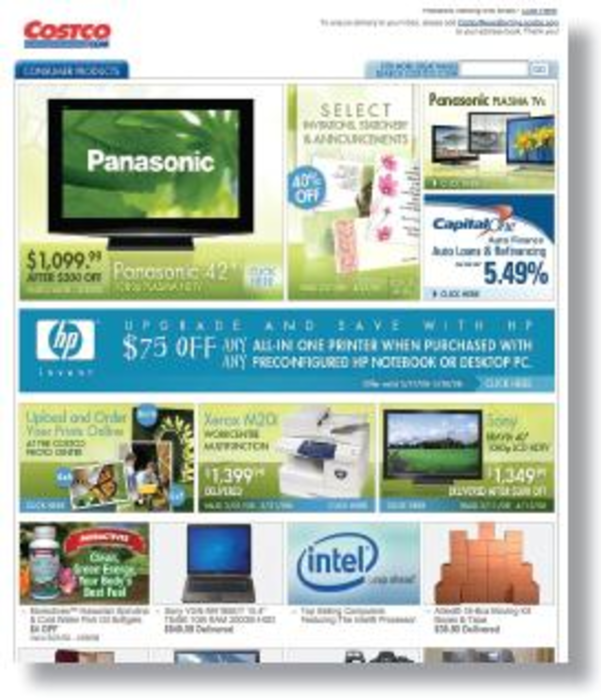
I have a love/hate relationship with this e-mail. At first, I was blinded by all the products, fonts, logos and callouts. Then after my eyes adjusted, I realized what Costco is doing is in line with its brand.
The e-mail mirrors the experience of wandering around the store, in awe at the range of products and merchandise for low prices. I’ve gone into Costco on a mission to buy diapers, only to leave with a new flat-screen TV and two pounds of Alaskan king crab legs.
The patchwork formatting is well done with enough white space around each module to create visual separation. However, the typography treatment is a cacophony of style. I can easily browse based on my primordial urges for shiny objects. But, I wish it would feature products relevant to me, point me to the Web site and be done with it. Sometimes, less really is more.
Seen some great DM? Sendyour Direct Choice to [email protected].


