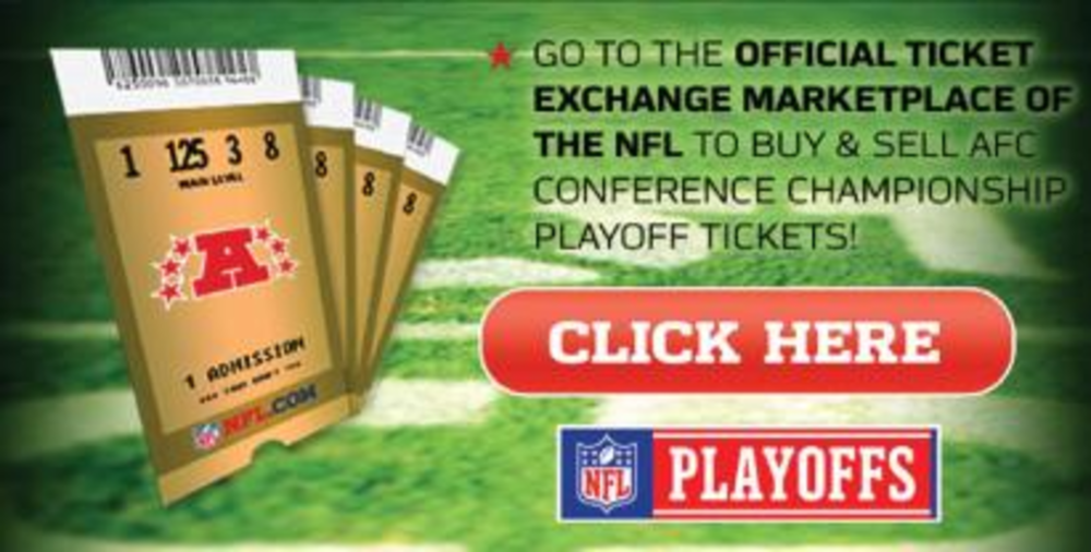
This piece of e-mail creative from the National Football League seemed to scream, “Hello! Hello! Can you hear me?” It practically jumped out of my inbox and strangled me.
It shouts with all caps and, for sure, is the biggest button I have ever seen in an e-mail. It is bigger than the logo, for crying out loud. Not only is it an excessively large graphic, it has a totally generic call to action: “click here.”
Seriously? That is so 1998, and people are smarter than that now and know they can click on what looks like a button. The NFL must think that if it shows tickets and a giant “click here” button, my brain would switch off and I would click immediately, based on my primordial, football-loving instinct.
However, the NFL does a lot of things right in this e-mail. It promotes the vanity URL, and they let it stand as a single and concise message without getting carried away with cross-promotions. It also has a direct and clear headline, and it looks and feels like the league’s brand. So why did the league have to blow all that good work up by including this sledgehammer of a button?
All in all, the NFL does an amazing job of e-mail marketing. However, with this particular e-mail, it went over the top on design and used vague language in its call to action — thereby canceling out a really compelling message. Maybe if it had just added a few exclamation points to the button, I would have felt better.
Send your Direct Choice to [email protected]


