- Tension: A company can spend billions reinforcing a visual identity and still fail to register in the minds it targets.
- Noise: The branding industry’s obsession with recognition metrics distracts from the deeper question of what logos actually do for people.
- Direct Message: Familiarity without meaning is the most expensive illusion in corporate branding.
To learn more about our editorial approach, explore The Direct Message methodology.
Editor’s note: This article has been updated in April 2026 to reflect the latest developments in digital marketing and media.
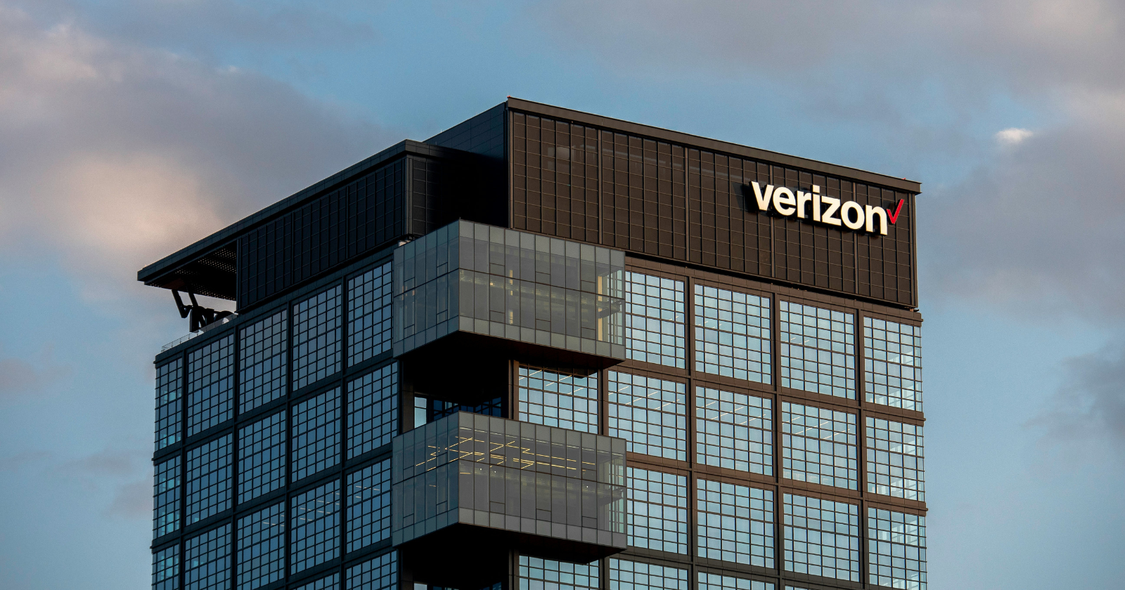
Here is a number that should make every brand strategist lose sleep: only 30% of the public could identify Verizon’s checkmark logo. Let that sink in. The largest wireless carrier in America, a company that touches the daily life of over 100 million subscribers, spent more than two decades building a visual identity that seven out of ten people could not attribute correctly. They saw the checkmark. They used Verizon’s network every day. And yet, when asked to match the symbol to the brand, most of them drew a blank.
I keep a journal of marketing campaigns and brand decisions that failed spectacularly. I call it my “anti-playbook,” and it has taught me far more about consumer behavior than any success story ever could. Verizon’s logo predicament earned its own dedicated page. Because this failure is fascinating precisely because it happened in plain sight, over decades, with billions of dollars in media spend reinforcing it. The checkmark was everywhere: on billboards, storefronts, devices, advertisements during the Super Bowl. And still, it did not stick. The question that matters here is not how this happened. The question is what this reveals about the gap between what brands believe they are communicating and what consumers actually absorb.
The Illusion of Twenty Years on Repeat
Repetition is the oldest trick in the branding handbook. Show people a symbol enough times, and they will associate it with you. This principle has driven corporate identity strategy since the mid-twentieth century, and it has worked beautifully for companies like Nike, Apple, and McDonald’s. But Verizon’s experience exposes a critical flaw in this assumption: repetition without distinctiveness is background noise. The human brain is remarkably skilled at filtering out stimuli that carry no emotional or semantic weight. A checkmark, by its nature, is generic. It communicates completion, approval, correctness. These are useful concepts, but they belong to no one.
A study published in the Journal of Business Research, reviewing four decades of brand logo literature, highlights the pivotal role of logos in communicating a company’s identity and fostering brand recall. The research emphasizes that a well-designed logo can significantly enhance recognition. But the inverse is equally true: a logo that fails to communicate something specific about the brand’s identity becomes decorative wallpaper, no matter how many times it appears.
During my time working with tech companies in the Bay Area, I observed this pattern repeatedly. Organizations would invest heavily in visual identity systems, running focus groups and design sprints, only to discover months later that their target audience confused their mark with a competitor’s. The problem was never the budget or the exposure. The problem was that these logos said nothing that mattered to the person seeing them. They were aesthetically pleasant and strategically hollow.
Verizon’s checkmark occupied a particularly treacherous position. A checkmark is so ubiquitous in daily life that the brain has no reason to associate it with a single entity. It appears on to-do lists, test results, software interfaces, and voting ballots. Asking consumers to carve out a dedicated neural pathway for one more checkmark, this time belonging to a telecommunications company, was asking them to override a lifetime of contextual associations. And the brain, ever efficient, refused.
When the Industry Mistakes Visibility for Connection
The branding industry has a measurement problem it rarely talks about honestly. The standard metrics of success, aided recall, unaided recall, brand awareness scores, create a seductive illusion. A company can score well on “brand awareness” surveys while simultaneously failing at logo attribution. These are different cognitive functions. Knowing that Verizon exists as a wireless carrier is one thing. Connecting a specific visual mark to that knowledge is another. The industry often collapses these distinctions, and the result is a distorted picture of brand health.
Consider the narrative that surrounded Verizon for years. Shep Hyken, a well-known customer service and CX expert, has noted that “Verizon is one of the most recognizable brands on the planet.” And he is correct, in a specific sense. People recognize the name. People recognize the red color palette. But brand recognition built on a name and a color is fundamentally different from brand recognition built on a symbol that carries meaning. Nike’s swoosh communicates movement and aspiration without the word “Nike” anywhere near it. Apple’s bitten apple communicates innovation and simplicity on its own. Verizon’s checkmark communicated… a checkmark.
What I’ve found analyzing consumer behavior data is that the brands with the strongest logo attribution share a common trait: their symbols encode a story or a feeling that is specific to them. The story does not need to be complex. The Nike swoosh is a wing. The Target logo is, well, a target. These symbols have a built-in mnemonic anchor. They give the brain something to hold onto beyond mere shape recognition. A generic symbol, no matter how cleanly executed, provides no such anchor. It drifts in cognitive space, unattached to any particular meaning.
The branding conversation also suffers from a heavy dose of survivorship bias. We study the logos that worked and reverse-engineer principles from them, ignoring the thousands of well-designed marks that vanished without impact. This creates an echo chamber of confident advice that often overlooks the most fundamental question: does this symbol give the audience a reason to remember who it belongs to?
What Recognition Actually Requires
A logo is only as strong as the meaning people attach to it, and meaning cannot be purchased through repetition alone. It must be earned through specificity, emotional resonance, and the courage to claim a visual territory that belongs to no one else.
This is the insight Verizon’s rebrand quietly acknowledged. After more than twenty years, the company moved away from its checkmark, conceding through action what the data had been saying all along. The symbol had not failed because of poor design execution or insufficient media spend. It had failed because it tried to own something unownable. A checkmark is public property, a piece of visual language so fundamental that no corporation can fence it off.
Building Symbols That Survive the Scroll
Growing up in a small town in Oregon where the nearest mall was two hours away, I developed an early skepticism about the promises brands make. When you only encounter corporate identity on road trips and television, you see it with fresh eyes. You notice when a logo feels like it belongs to something specific and when it feels interchangeable. That childhood distance gave me a perspective I still carry: the best brand marks are the ones that make you curious even before you know what they sell.
For anyone building or refreshing a brand identity, Verizon’s experience offers a concrete set of lessons. First, test for attribution, not awareness. Awareness surveys will tell you people have heard of your company. Attribution tests will tell you whether your visual mark is actually doing its job. These require different methodologies and produce different, often uncomfortable, results.
Second, resist the gravitational pull of universal symbols. Checkmarks, globes, abstract swooshes, and interlocking circles feel safe precisely because they are familiar. But familiarity in logo design is a trap. The brain needs friction, a small moment of productive confusion or delight, to encode a new association. A logo that looks like everything else gets filed under “everything else.”
Third, consider the behavioral psychology behind recall. Memory formation depends on distinctiveness, emotional engagement, and repeated association with a consistent context. Verizon had the third element in abundance but lacked the first two. The checkmark was distinctive within no context. It generated no emotional response specific to the brand. And so it lived and died as ambient visual data.
Finally, audit your brand’s visual equity with the honesty of an outsider. Show your logo to people who have never interacted with your company and ask them what it makes them feel, what it reminds them of, and who they think it belongs to. If the answers are vague, universal, or wrong, you have your signal. No amount of media spend will fix a symbol that lacks inherent meaning. That is the lesson Verizon learned over two decades and billions of dollars. The rest of us can learn it for the cost of asking the right questions early.